Building a Startup? Iceberg’s UI Design Tips for Success 2025
Introduction
The Role of UI Design in Startup Success
In today’s competitive landscape, UI design plays a pivotal role in the success of startups. It’s no longer just about aesthetics; it’s about creating a seamless user experience that drives engagement, retention, and ultimately, business growth. A well-designed interface can be the difference between a user sticking around and bouncing off your platform. Startups need to ensure that their products are not only functional but also intuitive, as this directly impacts customer satisfaction and conversions.
How Iceberg Helps Startups Create Intuitive, High-Performing UI
At Iceberg, we understand that UI design isn’t a one-size-fits-all solution. Every startup has unique needs, challenges, and goals. Our approach is centered around creating custom, user-friendly interfaces that meet both the functional and aesthetic needs of your startup. From simplifying complex workflows to enhancing user engagement, we help transform your vision into a high-performing UI that resonates with your audience. Whether you’re launching a new app or refreshing your existing design, Iceberg’s expertise ensures your product will provide users with an effortless and enjoyable experience.
Overview of What This Article Covers
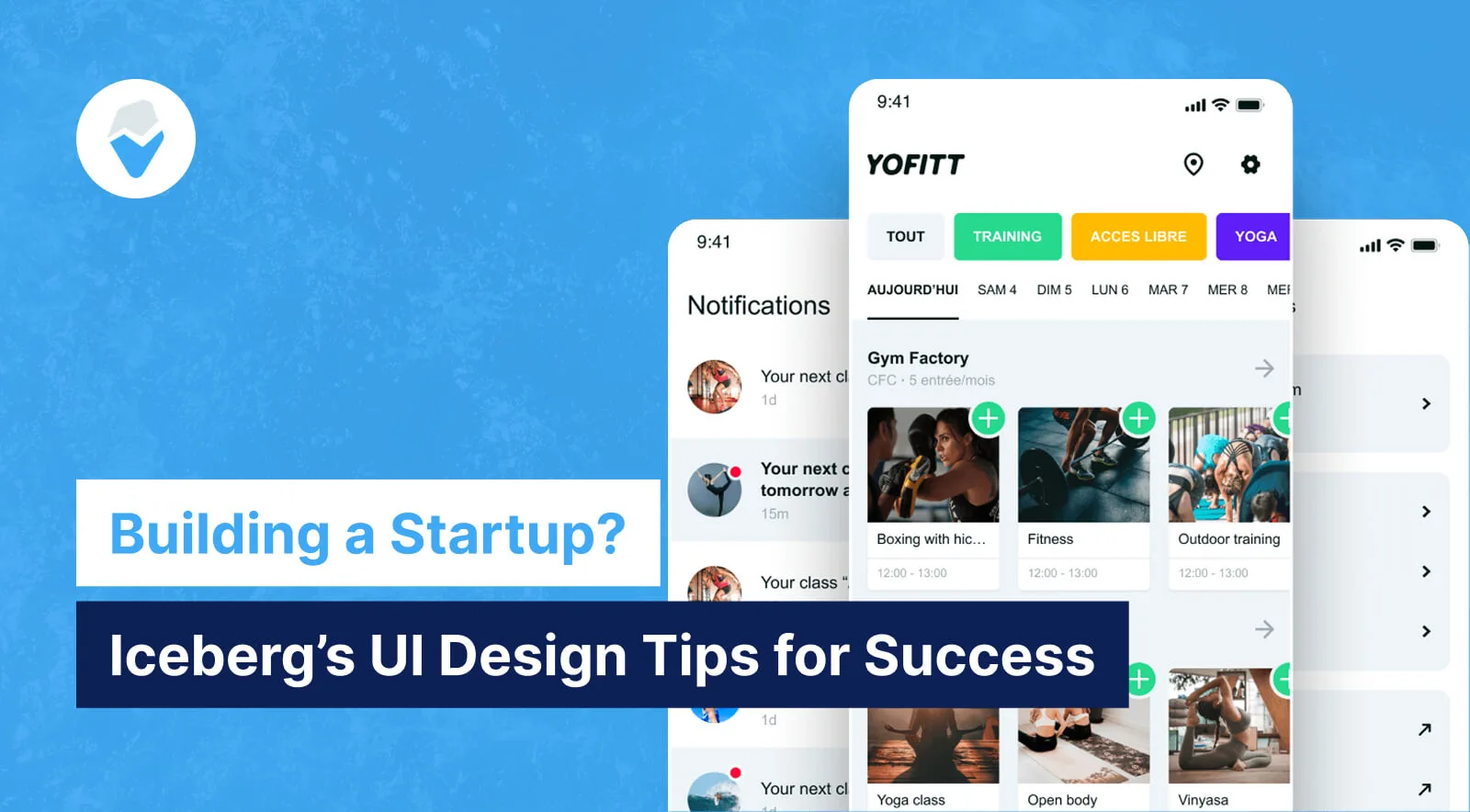
In this article, we’ll dive deep into the importance of UI design for startups and how it can influence your overall success. You’ll learn key strategies for designing intuitive interfaces, understanding the core principles behind effective UI, and how Iceberg can guide your startup through the design process. We’ll also highlight real-world success stories, like our work with YoFitt, where UI design played a crucial role in improving user retention and conversion rates. Let’s explore the best practices and tips that can help your startup thrive in a competitive market.

Understanding UI Design for Startups
Why UI Design Matters for Startups
UI design plays a crucial role in the success of a startup. It’s not just about aesthetics; it’s about creating a seamless experience that aligns with user expectations and drives business goals. Below are some key benefits that great UI design brings to startups:
Key Benefits of Great UI Design:
- ✅ Better User Experience → Increases Engagement
A clean, intuitive, and responsive interface ensures that users can navigate easily and perform desired actions with minimal effort. A positive experience leads to greater user engagement, as users are more likely to interact with your platform if they find it user-friendly. - ✅ Stronger Brand Identity → Builds Trust
A cohesive and polished UI design reflects professionalism and consistency, which builds trust with your audience. A well-designed UI contributes to a stronger brand identity, making your startup memorable and encouraging repeat visits. - ✅ Higher Conversion Rates → Drives Sales
A streamlined UI helps guide users toward important actions, such as signing up, making a purchase, or subscribing. By optimizing design elements such as CTAs, navigation, and forms, you improve your startup’s ability to convert visitors into customers.
Common UI Mistakes Startups Make
When building a startup, many entrepreneurs and designers make certain UI mistakes that can hinder the user experience. These mistakes are often overlooked but can have a significant impact on the platform’s success. Let’s take a look at some of the most common mistakes and their potential effects.
Table: UI Mistakes & Their Impact
| Mistake | Impact on Startup |
|---|---|
| Cluttered UI | Confuses users, increases bounce rate |
| Poor Navigation | Frustrates users, lowers retention |
| No Mobile Optimization | Limits audience reach, especially for mobile users |
| Weak CTA Design | Fewer sign-ups & conversions |
- Cluttered UI: An overly complex or crowded UI with too many buttons, images, or text can overwhelm users, making it hard to focus on essential tasks. This confusion often leads to increased bounce rates as users abandon the site or app out of frustration.
- Poor Navigation: If users can’t easily find what they’re looking for, they will quickly leave. Complicated or hidden menus frustrate users and result in lower retention. A straightforward navigation system that clearly points to essential features will enhance user satisfaction.
- No Mobile Optimization: With the rise of mobile-first browsing, failing to optimize for mobile means missing out on a large portion of potential users. A non-responsive design will limit your reach, reducing engagement with mobile audiences.
- Weak CTA Design: Call-to-action buttons are pivotal in converting visitors into customers. If your CTAs are hard to find, poorly worded, or unattractive, your startup will likely experience fewer sign-ups and lower conversions.
Iceberg’s Design Philosophy for Startups
At Iceberg, we understand that UI design must evolve as the startup grows and that simplicity and usability are at the core of a great experience. Our design philosophy is centered on the following principles to ensure startups succeed with user-friendly and scalable UI solutions:
- Simplicity – Clear Layouts, Intuitive Elements
At Iceberg, we believe that simplicity is the key to a successful user experience. By removing unnecessary distractions and focusing on essential elements, we ensure that users have a smooth, easy-to-navigate experience. Simple layouts with clear, intuitive elements allow users to interact without confusion. - Scalability – Designs That Grow with the Startup
Startups evolve, and so do their design needs. Our UI principles emphasize scalability, ensuring that your design can grow and adapt as your platform adds new features, content, or users. Iceberg’s designs are future-proof, built to accommodate increasing complexity while maintaining a high-quality user experience. - User-Centric Approach – UI Tailored to Customer Needs
A successful UI design is built around the user. At Iceberg, we take a user-centric approach by continuously gathering feedback and optimizing designs based on real user behaviors and pain points. We ensure that every design decision is aligned with your customers’ needs, providing them with a seamless and engaging experience.
Key UI Design Tips for Startup Success
Designing an Intuitive Navigation
Navigation is one of the most essential aspects of UI design. For a startup, ensuring that users can easily find their way around your platform can significantly enhance the user experience. Here are a few tips for building intuitive navigation that users will love:
Checklist for Startup-Friendly Navigation:
- ✅ Use clear labels for menu items
Use simple, concise language for menu items to make it clear to users where they are headed. Avoid jargon or overly complex terms, and ensure that labels are easy to understand at a glance. - ✅ Implement a sticky navigation bar
Sticky navigation bars remain visible as users scroll down the page, providing easy access to important links. This ensures that users can always navigate to another page without scrolling all the way back up. - ✅ Provide a search function for better accessibility
A search bar enhances user experience by giving users a fast way to find specific content. It’s especially important for content-heavy websites or apps where users need to find specific information quickly.
Choosing the Right Color Scheme & Typography
The right color scheme and typography are crucial for establishing a strong brand identity and guiding user interactions. These elements influence user emotions and behavior, making it essential to choose them thoughtfully.
Color Psychology Principles:
- Blue → Trust & Reliability
Blue is often associated with trust, dependability, and professionalism. It’s commonly used in tech, finance, and healthcare industries to create a sense of security. - Green → Growth & Sustainability
Green represents growth, sustainability, and eco-friendliness. It’s often used by brands promoting wellness, environmental awareness, or health-related products. - Red → Urgency & Passion
Red is an intense, energetic color that evokes urgency and excitement. It’s perfect for calls-to-action (CTAs) or promotions where you want to spark immediate user interaction.
Table: Best Font Choices for Startups
| Font | Best For |
|---|---|
| Sans-serif (Roboto) | Tech & SaaS startups |
| Serif (Merriweather) | Luxury & editorial brands |
| Monospace (Courier) | Developer & coding platforms |
- Sans-serif (Roboto): Ideal for tech startups, especially SaaS products, Roboto offers a modern, clean, and easily readable font.
- Serif (Merriweather): This classic font is perfect for luxury and editorial brands, offering a sophisticated feel with its traditional design.
- Monospace (Courier): Great for developer platforms or technical products, Courier gives a retro, clean look that’s easy to read on coding interfaces.
Mobile-First Approach: A Startup Essential
In today’s digital world, mobile usage is on the rise, making a mobile-first design strategy an essential part of your startup’s success. By prioritizing mobile usability, your platform will cater to a larger audience and improve engagement.
Infographic-style Insights:
- “55% of users browse on mobile first.” With the majority of users accessing websites and apps via mobile, a mobile-first design approach is not optional—it’s a necessity for startups looking to expand their reach.
- “✅ Use responsive frameworks like Tailwind CSS or Bootstrap.” These frameworks are designed to make it easier to create responsive designs that adapt to various screen sizes, improving the user experience on any device.
Checklist for Mobile Optimization:
- ✅ Test UI on different screen sizes
It’s crucial to test your design on various devices (smartphones, tablets, etc.) to ensure that the UI works well across all screen sizes. - ✅ Optimize images for faster loading
Large images can slow down page loading times, especially on mobile. Use image compression tools and formats that maintain quality without sacrificing performance. - ✅ Avoid intrusive pop-ups
Mobile users often find pop-ups frustrating, especially those that cover a significant portion of the screen. Keep pop-ups minimal and easy to close for a more user-friendly experience.
Case Study – How Iceberg Helped YoFitt Create an Engaging UI
About YoFitt
YoFitt is a cutting-edge fitness app designed to provide users with personalized workout plans and direct access to certified trainers. The goal of YoFitt is to help individuals achieve their fitness goals through tailored exercises, nutrition plans, and expert guidance. However, as the app gained traction, YoFitt faced a major hurdle: low user retention and a high drop-off rate after the initial onboarding process.
To address these issues, YoFitt turned to Iceberg for a complete UI redesign aimed at improving user retention, increasing engagement, and driving more app downloads. Iceberg’s expertise in UI design for startups was the perfect fit to revitalize the user experience and make the app more engaging for both new and existing users.
Iceberg’s UI Design Strategy for YoFitt
After conducting a thorough analysis of YoFitt’s current UI and user feedback, Iceberg identified several key pain points that needed to be addressed in order to improve the overall user experience.
Problems Identified:
- Overcomplicated Onboarding: The onboarding process was too long, with seven steps that frustrated new users, leading to a high abandonment rate.
- Unclear Navigation: Users found it difficult to navigate through the app and locate key features such as workout plans, nutrition guides, and communication with trainers.
- Weak CTA Placement: The call-to-action buttons (CTAs), particularly for premium plans and workouts, were not positioned effectively, leading to lower sign-up rates for the pro version of the app.
Solutions Implemented:
Iceberg worked closely with YoFitt to implement a UI design overhaul that would simplify the user journey and improve user engagement.
- Simplified Onboarding: The onboarding process was streamlined, reducing the number of steps from seven to just three. This change helped users complete their setup faster and engage with the app’s core features more quickly, boosting retention rates.
- Enhanced Navigation: Iceberg added a bottom navigation bar with clear, easy-to-understand icons. This allowed users to access the most important features (workouts, nutrition plans, and trainer communication) with just a tap, improving usability.
- Optimized CTAs: Strategic placement of prominent CTAs like “Start Workout” and “Upgrade to Pro” in high-visibility areas (e.g., on the home screen and main dashboard) led to more conversions and increased sign-ups for the premium subscription.
Results & Impact on YoFitt’s Success
After implementing Iceberg’s UI solutions, YoFitt experienced a significant improvement in several key performance metrics, which contributed to their success in increasing user engagement and app downloads.
Table: Before vs. After Iceberg’s UI Optimization
| Metric | Before UI Redesign | After UI Redesign |
|---|---|---|
| User Retention | 42% | 78% |
| Conversion Rate | 5.2% | 14.6% |
| Average Session Time | 3 minutes | 7 minutes |
Key Takeaways from YoFitt’s Case Study:
- ✅ UI Simplicity Leads to Higher Engagement: By simplifying the onboarding process and improving navigation, users were able to engage with the app more quickly and easily, leading to increased retention.
- ✅ Good CTA Placement Improves Conversions: Properly placed CTAs led to a significant boost in conversions, with more users opting for the premium plans.
- ✅ Mobile-Friendly Designs Increase App Usage: By focusing on a mobile-first design, YoFitt was able to improve the overall usability of the app, keeping users engaged for longer periods and making the app more accessible across different devices.
Optimizing UI for Better Conversions
Call-to-Action (CTA) Placement Strategies
Effective call-to-action (CTA) buttons are crucial for driving conversions. Where you place them on your site or app can make a big difference in whether users take the desired action, such as signing up, purchasing, or upgrading. Below are some of the most effective CTA placement strategies that can help boost conversions:
Comparison Table of CTA Placements:
| Placement | Effectiveness |
|---|---|
| Above the fold | High engagement as users see it immediately upon landing. |
| After product description | Encourages informed decisions, allowing users to make a purchase after learning about the product’s features. |
| Sticky CTA button | Always accessible as users scroll, reducing friction in the conversion process. |
By experimenting with different placements and ensuring CTAs are strategically located, startups can increase their chances of driving higher engagement and conversion rates.
Loading Speed & Performance Optimization
A fast-loading website or app is essential for retaining users and ensuring a smooth experience. Slow load times can lead to frustration, higher bounce rates, and ultimately, lost conversions. Optimizing your UI’s performance is a key factor in improving conversion rates.
Key Strategies:
- Lazy Loading Images: Implement lazy loading for images so that they load only when they come into view. This improves page load speed and reduces initial load times, especially for image-heavy pages.
- Minify CSS & JavaScript: Compress CSS and JavaScript files by removing unnecessary characters, comments, and whitespace to reduce file size and improve page load speed.
- Use a Content Delivery Network (CDN): By serving content from geographically distributed servers, a CDN can decrease load times and improve the overall user experience, especially for users located far from your server.
Optimizing performance ensures users can interact with your app or website without delays, leading to better user retention and higher conversions.
A/B Testing for UI Improvements
A/B testing is an essential practice for continuously improving UI design and maximizing conversions. By comparing two variations of an element, such as a CTA button, startups can identify what works best for their audience and make data-driven decisions.
Step-by-step Guide for A/B Testing:
- Identify an Element to Test: Start by selecting a UI element that can influence conversions, such as the color or text of a CTA button, or the layout of a key page.
- Run Two Variations (A & B): Create two versions of the element, each with a slight difference. For example, you might test two different CTA button colors or text.
- Track Conversion Rates & Analyze Results: Use analytics tools to track how each version performs in terms of user interaction and conversion rates. After gathering sufficient data, determine which version led to better results and implement the winning variant.
A/B testing helps fine-tune UI elements, ultimately increasing their effectiveness and improving overall conversion rates.
Conclusion
In this article, we’ve explored the key role UI design plays in the success of startups. We’ve discussed how a well-optimized UI can enhance user engagement, build brand trust, and drive conversions. Iceberg’s approach to UI design—focused on simplicity, scalability, and a user-centric mindset—has proven to be a game-changer for many startups looking to stand out in a competitive market.
Recap of Iceberg’s UI Strategies for Startups:
- Simplicity: Clean, intuitive layouts that make navigation effortless for users.
- Scalability: Designs that can grow with your startup’s needs, ensuring long-term usability.
- User-Centric Approach: Crafting UI experiences that are tailored to your target audience’s needs, behaviors, and preferences.
YoFitt’s Success Story:
The case study of YoFitt’s UI transformation highlights how Iceberg’s strategies led to a significant increase in user retention and conversions. By simplifying onboarding, optimizing CTA placements, and improving navigation, Iceberg helped YoFitt boost user engagement and increase sign-ups for premium plans—demonstrating the true power of a well-designed UI.
Need expert UI design for your startup?
Whether you’re in the early stages or looking to improve your existing app or website, Iceberg’s team of experienced designers can help you create a UI that drives success. Contact Iceberg today to start your journey toward a more engaging and profitable user experience!


